Screen Resolution Simulator
Test how your website looks on any device with our free Screen Resolution Simulator. Choose from desktop, laptop, mobile, or TV screen sizes and instantly preview your site in real-time. Perfect for web designers, developers, and marketers to check responsive layouts and user experience across different resolutions.
Share on Social Media:
🖥️ Screen Resolution Simulator – See Your Website Like Every User Does
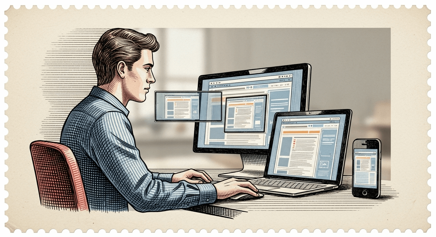
In today’s digital-first world, your website is viewed on hundreds of different screen sizes — from small mobile phones to 4K TVs. But how do you know if your design looks great everywhere?
That’s where the Screen Resolution Simulator by SEO Magic Tools comes in.
This simple yet powerful tool allows you to instantly view your website on multiple device resolutions, ensuring a flawless and responsive experience for every visitor — no coding, no browser extensions, no guesswork.
Just select a device type (desktop, laptop, mobile, or TV), choose a model, and the tool will adjust the viewport to the exact screen size. Enter your website URL, and voilà — see your website live as if it were opened on that device.
🌐 What Is the Screen Resolution Simulator?
The Screen Resolution Simulator is a free online tool designed to preview how a website appears on different screen resolutions and device types.
It replicates the exact viewport and pixel dimensions of various devices, allowing developers and designers to:
- Check layout and responsiveness
- Identify UI/UX issues
- Optimize for multiple devices
- Ensure perfect visual balance across screens
It’s like having every device on your desk — without needing them physically.
⚙️ How the Tool Works
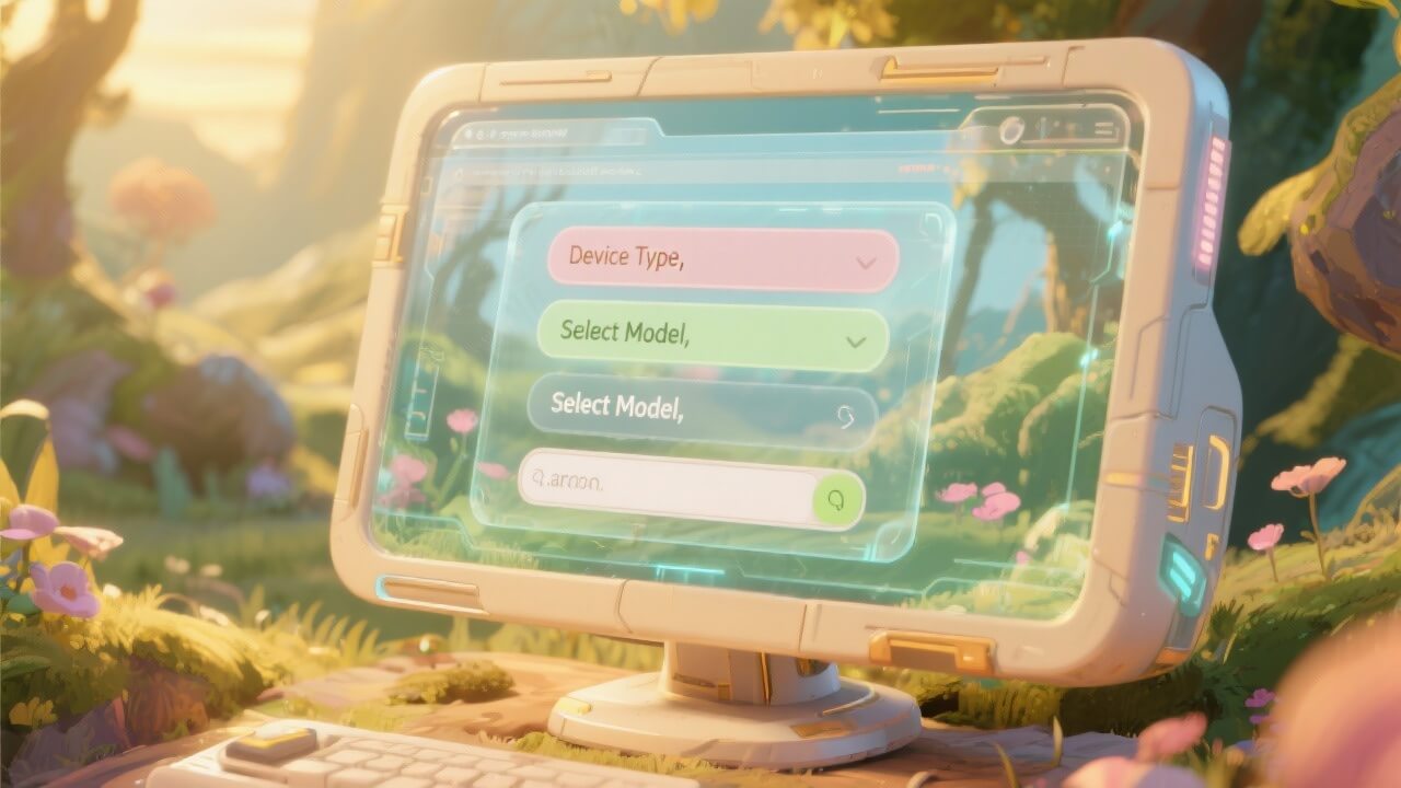
Using this tool is as simple as 1-2-3:
- Select Device Type: Choose from Desktop, Laptop, Mobile, or TV.
- Choose Model & Resolution: Pick a specific model (like iPhone 15, MacBook Pro, or Samsung Galaxy Tab).
- Enter Your Website URL: The simulator automatically opens your site inside a real-size frame.
You’ll instantly see how your site appears on that device — accurate down to the pixel.
It even allows you to switch orientations (portrait/landscape) to test both mobile modes.
📱 Supported Screen Categories
The Screen Resolution Simulator includes a variety of preloaded screen profiles:
🖥️ Desktop & Laptop Screens
- 1920×1080 (Full HD)
- 1366×768 (Standard Laptop)
- 2560×1440 (QHD)
- 3840×2160 (4K Display)
📱 Mobile Screens
- iPhone 15 / 14 / SE
- Samsung Galaxy S24 / A55
- Google Pixel 8
- Xiaomi / OnePlus Models
💻 Tablet Screens
- iPad Air / iPad Pro
- Samsung Galaxy Tab
- Amazon Fire HD
📺 TV Screens
- Full HD Smart TV (1920×1080)
- 4K UHD TV (3840×2160)
Each profile matches real-world dimensions, ensuring an authentic display preview.
🧠 Why Use a Screen Resolution Simulator?

Your website may look perfect on your desktop but broken on someone’s phone.
Different screen sizes, resolutions, and pixel densities can distort layouts, crop images, or misalign buttons.
This tool helps you:
✅ Ensure responsive design consistency
✅ Catch design bugs early
✅ Enhance mobile-first experience
✅ Save testing time
✅ Deliver better UX/UI across devices
In short — you can perfect your website for every visitor, every screen, every time.
💡 Key Features

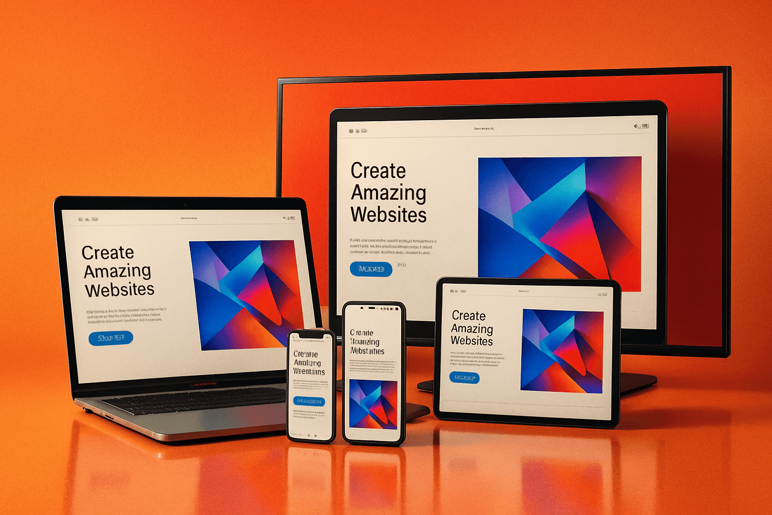
1. Real Device Viewports:
Accurate simulation of desktop, mobile, tablet, and TV screens.
2. Instant Website Preview:
Just enter the URL and watch your site load instantly in the selected resolution.
3. Custom Resolutions:
Manually set width and height to test unique screen setups.
4. Multiple Models:
Predefined popular devices for quick testing.
5. Portrait & Landscape Mode:
Toggle instantly to check responsive behavior.
6. No Installation Needed:
100% web-based, secure, and fast.
7. Free Forever:
Unlimited usage, no signup, no hidden fees.
📊 Who Can Benefit from This Tool

| User Type | Benefit |
|---|---|
| Web Developers | Test website layouts, CSS, and scripts on different screens. |
| Designers | Check if design elements scale properly across devices. |
| Marketers | Verify landing page responsiveness for better conversions. |
| Bloggers | Ensure posts and media look perfect everywhere. |
| Businesses | Confirm that users enjoy consistent UX on all devices. |
Whether you build sites for clients or manage your own brand, this tool saves time, effort, and costly design fixes.
🚀 Why This Tool Is Better
There are many responsive testing tools online, but SEO Magic Tools’ Screen Resolution Simulator stands out because it’s:
- 💨 Fast: Real-time results with smooth rendering.
- 💻 Accurate: Matches device resolution exactly.
- 🛠️ Simple: No setup or coding required.
- 🔒 Private: No URL tracking — full data privacy.
- 💸 Free: Unlimited testing at no cost.
Plus, it’s built with a modern interface that feels as professional as a developer’s studio app.
🎯 How It Helps SEO & User Experience

A mobile-friendly, responsive design is a key Google ranking factor.
With this simulator, you can:
- Detect mobile layout issues before launch.
- Ensure fonts, buttons, and forms work correctly.
- Prevent high bounce rates due to poor mobile design.
- Impress clients with device-accurate previews.
The result?
Better UX = Higher engagement = Better rankings.
🔍 Pro Tips for Best Use
- Always test multiple resolutions before launching a site.
- Switch between portrait and landscape for mobile devices.
- Focus on readability and button spacing on smaller screens.
- Compare your site on different models to ensure consistency.
- Re-test after CSS or layout changes.
These quick checks can dramatically improve your site’s usability.
🌟 Example Use Case

Imagine you’re a web designer creating a landing page for a client.
You finish your design on a 27-inch monitor — it looks stunning.
But when the client opens it on their iPhone, half the banner is cropped and the button overlaps the text.
Using the Screen Resolution Simulator, you could have spotted this in seconds — saving embarrassment, time, and revisions.
That’s why professional designers love this tool.
🔒 Privacy & Security
Like every tool on SEO Magic Tools, your privacy is guaranteed.
The simulator loads your website directly from your browser — no data storage, tracking, or logging.
Your URLs remain private and temporary.
🧩 Advantages Over Browser Dev Tools
While browser developer tools offer “responsive mode,” they often lack true screen scaling or device realism.
This tool simulates actual device resolutions, giving a more accurate visual experience.
It’s perfect for non-technical users who want professional results without dealing with developer consoles.
📈 Why It’s My Favorite Tool (And Many Users Agree)
It’s simple — this tool brings clarity.
When you can see exactly how your users view your website, you understand your audience better.
It bridges the gap between design, performance, and experience — which is what SEO Magic Tools stands for.
🔚 Conclusion
The Screen Resolution Simulator by SEO Magic Tools is an essential utility for anyone serious about web performance and design consistency.
From developers fine-tuning CSS to marketers testing landing pages, this free and instant simulator delivers clarity and confidence.
Test, preview, and perfect your site — across every screen — before your visitors do.
Try it now and experience the easiest way to make your website truly responsive, professional, and future-ready.